Photo book delivery time max. 7 days Photo book delivery time max. 7 days


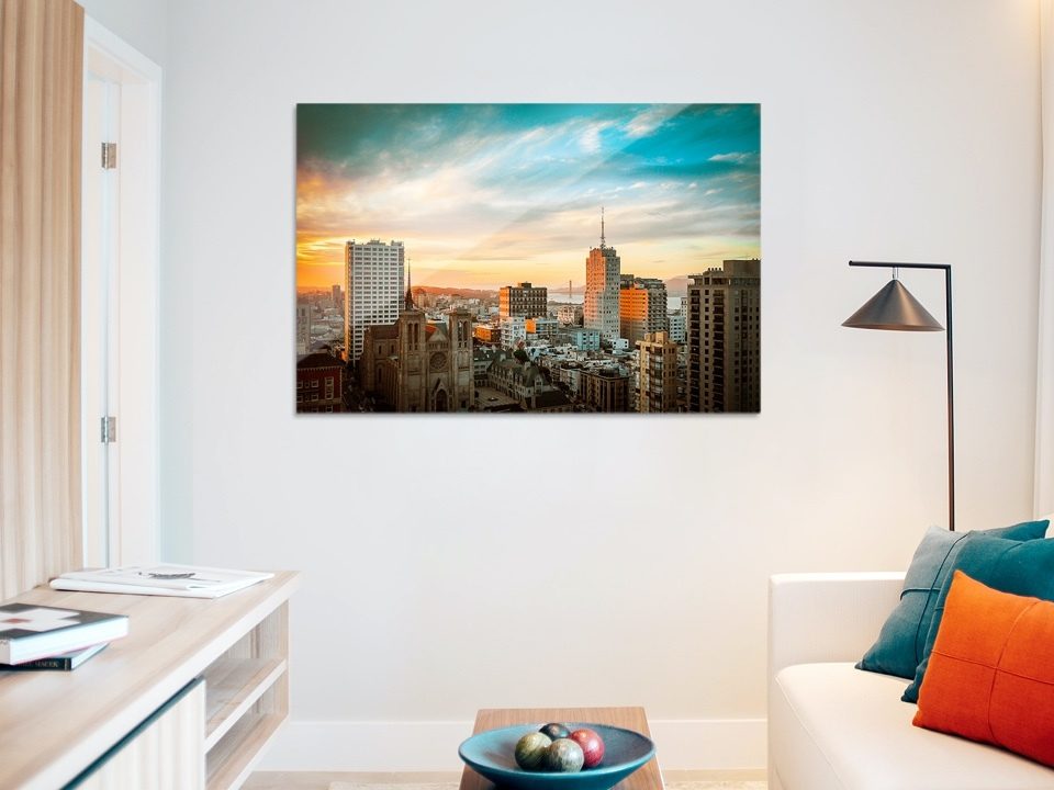
Although nowadays photos are primarily looked at on-screen, a print is a photo’s ultimate ambition. A beautiful print, maybe framed, or not, on the wall. It’s something we all strive for.
Yet, prints can disappoint at the outset. They can be too dark, have colour cast or sometimes even both! All issues that relate to poor colour management, which we’ll now tackle …
What is colour management actually?
‘A method to effectively calibrate the entire scanner/camera, monitor and printer system, to attain consistent, predictable colour rendering!
This is especially important in the (photo) graphics industry as a great deal of (valuable) time is lost to correction and the final print. However, a comprehensive system is extremely versatile.’
Unfortunately, it doesn’t always go according to plan, as each process features its own colour space. Starting with the human eye; we can see far more than can ultimately be rendered on a monitor or print. So, however crazy it might be hearing it from a prolab like us: experience has taught us that ‘you cannot print what you see, but with good colour management you can (approximately) see what you print.’ We’ll try and explain what we mean by that a little more below. Curious?
1. A good monitor is the starting point.
Firstly, you need a good quality, properly calibrated monitor. We calibrate in line with the Dutch Institute for Digital Photography’s guideline: 6500 K; Gamma 2,2; Clarity: 120 cd/m2 (we recommend 90 cd/m2). A monitor might just be the most important link in the shot-to-print workflow. Let’s assume you work in RAW. You ‘develop’ the photo visually, you look at the monitor, and make adjustments in line with what you see. In this instance it’s crucial you have a good quality, easily configurable monitor. So don’t stint on quality, opt for a broad colour spectrum and enhanced detailing. For any photographer looking to have perfect colours in their prints, this is certainly an investment worth the effort.
But, there’s more to it than a good quality monitor. As a rule, modern monitors are far too bright. This might look great, but this brightness is usually way too high and doesn’t yield a print that reflects reality … as in actuality it isn’t that beautiful and bright at all. Which is why you’ll have to calibrate it. You can find more information about this on our support page. This needn’t cost the earth. Once it’s done configuring your monitor, the calibration software makes a display screen profile which is saved on your computer where you can also access your operating system, Photoshop and Lightroom. Great!
2. Monitor workspace
Your workspace will also have to be calibrated. We adopt the Dutch Institute of Digital Photography’s guideline when it comes to monitor and workspace calibration.
The workspace is set up in line with ISO 3664:2009. Only neutral colours in the workspace, preferably light grey. Standard lighting only: colour temperature 5000 K, colour rendering index at least 90, ideally above 94, or as high as you can get. Monitor light level should be between 32 and 64 Lux. For photographers wanting to use an exposure meter: ISO value: 100; shutter speed: 1 second; Aperture: between 4 and 5.6
And this might be even more relevant with ‘too dark’ photos: to analyse printing on paper the same applies to the monitor workspace as it does to the lighting colour, it’s just the amount of light should be many times higher: around the 2000 Lux mark. Light level for printing should be 2000 Lux. This equates to 60x (!!) as much light as with monitor analysis. For photographers with an exposure meter: ISO value: 100; shutter speed: 1/60 second; Aperture: between 4 and 5.6
3. Configuring Photoshop
Thanks to the display screen profile Photoshop knows how the monitor is configured, but do you know how Photoshop’s colour management settings are configured? Many Photoshop users have their settings configured to US settings, which is particularly important when working with CMYK, which is precisely what we don’t want!
The RGB setting is far more relevant to you as a photographer. In the Photoshop ‘Edit’ menu, you’ll find ‘Colour settings’. Here Photoshop has various options under ‘settings’. The largest colour space in it is ProPhoto RGB, but Adobe RGB is also a large colour space if you’re working with RAW files; the colour space is the ideal place to edit your photos in.
So, what do we do with the colours that can no longer be rendered in the target? After all, there’s no printer that can print ProPhoto or Adobe RGB, nor is there any paper that can yet either. Choose between ‘Relative colormetric’ or ‘Perceptual’. And to ultimately use your photos online, you need to convert them to sRGB.
As a prolab we work with laser image setters and expose on light-sensitive, silver halide paper. These printers work in RGB, using three laser colours (red, green and blue). So, never submit your photos in CMYK as we’ll be sending you back rather peculiar prints.
4. Use printer profiles
As already mentioned above, the printer and paper you’ll be using are equally important factors. We use our own ICC profiles. When you submit files in sRGB or Adobe RGB, we automatically convert these into our most up-to-date profile. So, in principle, you don’t have to do a thing. But, would you like to go a step further and test how our printers process your colours? If so, download our profiles, fully install them and take a closer look.
5. Prevent darker prints
All too often we hear: my print is too dark. Or, in other words, you think your print too dark. There are a number of reasons why the impression might arise that the print is too dark. It’s all about the difference between the light your monitor emits and the light you’re looking at your print under. As also explained under point two.
A monitor emits light, so a photo will always be lighter on that, compared to a photo print offered up against it. Strictly speaking, you should look at your photo under a daylight lamp, which emits significant light, meaning the photo will concur with a photo displayed on a properly configured monitor. But let’s be honest, on the whole, wherever you end up looking at, or hanging your photo, there won’t be a daylight lamp handily placed too. So what you really should do is keep in mind where you’ll be hanging, placing or looking at the photo, and tweak your edits accordingly.
When calibrating, try configuring your monitor slightly less brightly. Take another look at the photo in Photoshop or Lightroom. You might need to now configure it more brightly. Decide the best light to look at your photo under, or where you’ll be hanging it. Ideally, this should have the same light intensity as that of the monitor.
See for yourself how consequential the light is under which you’ll be looking at the photo, by walking through the house with a print, and by even taking it outside. You’ll see how the colours constantly change.
6. Use optimisation, or brighten photos
If your monitor is configured too brightly, your prints will generally be too dark (as mentioned previously). If they stay too dark after having configured the monitor to reduced brightness, you can apply a last resort in Lightroom. In the Print – Edit Print pane you can tick and then slide the Brightness and Contrast sliders. This will give you increased brightness and contrast. You’ll have to find the right settings by trial & error, which may take some time and effort, as you’ll only get to see the results on the actual print. However, once you have found the ideal setting for a particular paper/printer combination, you can apply this to your prints.
If you do not have all these Photoshop and Lightroom options, or find this all a little overwhelming, we have another alternative for you: Tick ‘optimisation’ in our software. This means your photos will be automatically corrected by our machines for colour, brightness and contrast. Optimisation is standard at many print venues. Not with us though, as many photographers make manual tweaks which makes this option superfluous. But, if you don’t do your own edits and if you’re unsure whether your monitor is properly configured, you can always tick this option.
A challenge for us all then. But if you’re not in full control of the file, we won’t know what to do with it and will print in line with our trusted Dutch Institute of Digital Photography guideline. If it then ends up looking different on your monitor as it e.g. is configured too brightly, we’ll always print it darker than you’d like. So, prevent prints that are too dark and prepare your workspace, monitor and tools you’ll be using as best you can, to attain the perfect print.


Also interesting...


